Optimizing Cura Slicer for Clear Text Embossing
- Choose clear and legible fonts with a minimum height of 2mm for clarity.
- Utilize a layer height of 0.1mm or lower for fine details in your text.
- Optimize text placement and orientation to enhance engraving effects.
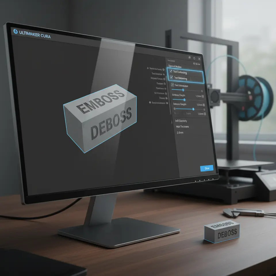
Understanding Text Embossing and Debossing
Embossing creates raised text or designs on the surface of a print, while debossing creates recessed designs. Both techniques can elevate your 3D models, providing a tactile dimension that enhances their design and functionality. However, achieving clarity in these features—especially when using a slicer like Ultimaker Cura—requires careful consideration of various factors.
Key Factors for Achieving Clarity in Text 3D Printing
1. Font Size and Style
Choosing the right font is crucial. Make sure it’s clear and legible. Sans-serif fonts tend to work better for 3D printing due to their simplified forms. Additionally, keep the font size reasonable; for example, text below 2mm in height may not render well. It’s advisable to test different font sizes and styles to compare the print outcome.
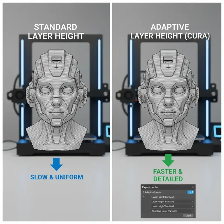
2. Layer Height
Adjusting the layer height plays a significant role in the clarity of your text. A smaller layer height can produce finer details, making it easier to define embossing and debossing effects. A layer height of 0.1mm or lower is often recommended for intricate text. However, remember that this may increase print time, so balance quality with efficiency.
3. Orientation
The orientation of your text during the slicing process can greatly influence the final appearance. When embossing, consider positioning the text on the horizontal plane. This approach allows for better surface quality on upward-facing portions of the text. Meanwhile, for debossed lettering, ensure your text is slightly inclined to enhance the engraving effect.
4. Infill Settings
Adjusting infill percentages and types can also contribute to clarity. While 100% infill may not always be necessary, a higher infill can provide more support for letters and enhance the overall sturdiness of thin text designs.
5. Printing Temperature
The extrusion temperature can affect the texture and clarity of your print. A temperature that’s too low may lead to poor layer adhesion and unclear details, while a temperature that’s too high can cause stringing and blurring. It’s good practice to experiment with temperatures, starting around the middle of your filament’s recommended range.
6. Brim and Raft Settings
Supporting small or detailed text with a brim or raft can stabilize the print and prevent curling. However, removing them without damaging the lettering can be tricky, so plan your designs accordingly.
Practical Takeaways for Optimizing Cura Settings
Here are some practical tips for optimizing your Cura settings when working with text:
- Font Size: Start with a minimum height of 2mm for legible text.
- Layer Height: Use 0.1mm or lower for better detail and clarity.
- Orientation: Place text near horizontal to optimize surface quality.
- Infill Percentage: Set between 20-30% for standard lettering, increasing for finer details.
- Temperature Settings: Match filament specifications, and test within a range of ±10°C.
- Brim/Raft Use: Enable brims for stability on small, intricate prints.
Testing and Troubleshooting
As you embark on your text embossing and debossing projects, it’s essential to conduct tests. Create small samples with differing settings and orientations to identify what works best for your specific printer and filament.
If your prints are still not achieving the clarity you desire, consider these further troubleshooting steps:
- Increase the wall line count to create a thicker boundary giving more definition to the text.
- Use slicing strategies such as “Support Blockers” for debossed sections to improve surface details.
- Regularly calibrate your printer’s extrusion and temperature settings to ensure optimal performance.
Conclusion
With the right adjustments, Ultimaker Cura can be an excellent tool for creating high-quality text embossing and debossing in your 3D prints. By understanding essential factors such as font selection, layer height, and orientation, you can improve the clarity of your designs and elevate your printing projects.
If you’re interested in exploring more techniques on optimizing your Cura settings or other 3D printing topics, check out our guides on Optimizing Cura for Small Cosmetic Prints and Cura Slicer Custom Scripts.
For even more insights, visit our main page for a wealth of 3D printing knowledge at CuraSlicers.com.
Happy printing, and be sure to subscribe to our blog for more tips and tricks on achieving the best results in your 3D printing endeavors!
For a comprehensive guide on Cura’s capabilities, refer to the official Ultimaker Cura documentation.
FAQ
Q: What is the best font for 3D printing text?
A: Sans-serif fonts generally work better for clarity in 3D print designs.
Q: How does layer height affect text clarity?
A: A smaller layer height allows for finer details, improving the clarity of embossing and debossing.
Q: Should I use support for text projects?
A: Yes, using brim or raft settings can help stabilize small or intricate text during printing.